

.png)
Brewed Awakening: Brand Identity
Sector: Coffee Shop / Hospitality
Style: Fresh · Coastal · Relaxed
Overview
Brewed Awakening is a coastal-inspired café brand built around slow living, crafted flavours, and a fresh, modern brunch culture. The identity draws from ocean landscapes, sunlit mornings, handmade ceramics, and a relaxed Mediterranean sensibility. The brand aims to feel warm, contemporary, and effortlessly inviting, elevating everyday coffee moments into a considered experience.
Colour & Mood
At the centre of the Brewed Awakening identity is a coastal-inspired palette built around deep Ocean Blue—a grounding, confident shade that anchors the brand across packaging and signage. It’s paired with Shore Blue, a bright and airy tone that brings freshness and open-sky clarity. Neutral shades of Clay Beige and Slaked Lime Grey introduce balance, echoing sunlit walls, sandy textures, and handcrafted ceramics. Together, they create space for the bolder elements to stand out. A pop of Sunset Yellow injects warmth and energy, inspired by golden-hour light and vibrant brunch culture. This contrast lifts the palette from calm to memorable, adding a laid-back Mediterranean brightness.
Together, the palette delivers:
-
Freshness and clarity, rooted in coastal mornings
-
Warm, inviting character that feels easy and approachable
-
A balanced interplay of calm neutrals and energetic accents
-
A memorable visual identity that stands out across packaging, interiors, and digital platforms
The result is a colour system that feels sunlit, modern, and refreshingly coastal—perfectly aligned with the brand’s relaxed, slow-living brunch experience.
Brand Elements
-
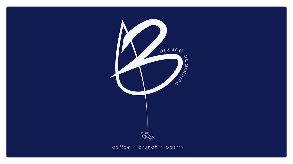
A unique hand-drawn “B” monogram serves as the foundation of the brand—fluid, expressive, and shaped with natural, wave-like strokes.
-
A signature turtle icon with a coffee-bean shell symbolises mindfulness, journey, and meaningful pauses throughout the day.
-
Visual elements are crafted to emulate organic movement, reflecting tides, brushstrokes, and the casual elegance of coastal life.
-
The overall concept blends playfulness and sophistication, creating an identity that is both characterful and premium.
Applications
-
Packaging: coffee bags, cups, lids, stickers, pastry bags, sugar sticks, and reusable mugs.
-
Print Collateral: posters, grand opening announcements, menus, and takeaway cards.
-
Digital Assets: social media templates, launch visuals, and promotional graphics.
-
Environmental Assets: signage, window decals, interior mood concepts, and merchandising displays.
Applications showcase a seamless blend of pattern, colour, and brand marks to create a distinctive and instantly recognisable identity.
Brand Experience
The experience of Brewed Awakening mirrors the calm, refreshing rhythm of a seaside morning. Customers encounter a space defined by warmth, craftsmanship, and sunlight—where ocean blues meet textured ceramics, and vibrant food styling complements the brand’s energetic yellow accents. Every touchpoint, from packaging to store environment, reinforces a sense of slow, intentional living, inviting guests to relax, savour, and reconnect.
