top of page


Brewed Awakening: Brand Identity
Sector: Coffee Shop / Hospitality
Style: Warm · Cosy · Hearty
Overview
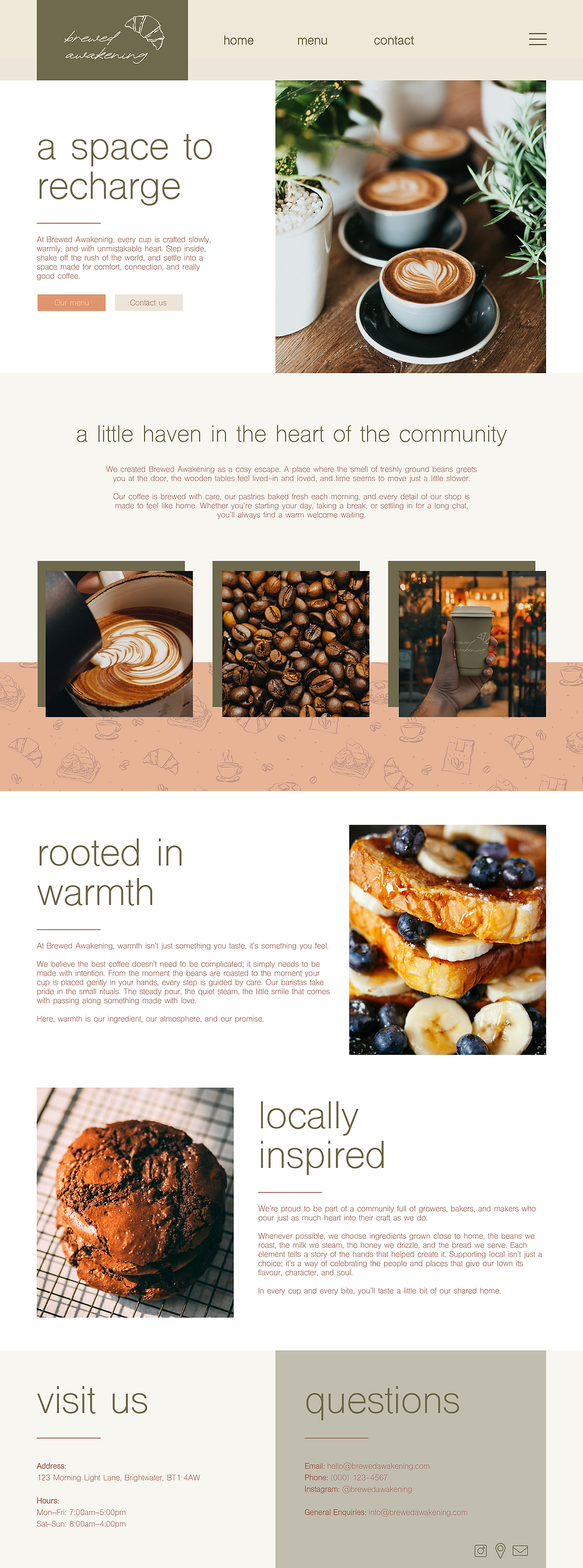
Brewed Awakening isn’t just a coffee shop... it’s an experience. The brand needed to reflect a relaxed, beachside attitude while still delivering a hit of high-energy personality. The goal was to create a visual world that feels warm, welcoming, and instantly recognisable, with colour and character woven into every detail.
Colour & Mood
At the heart of the system is the bold pink-and-red palette, inspired by current fashion and street trends. These colours are deliberately eye-catching, the kind of shades that stop you as you walk by, inviting you in for a coffee, a cold drink, or a freshly baked pastry. This vibrant pairing is balanced with seafoam and emerald greens, bringing in a natural, beach-inspired harmony.
Together, the palette delivers:
-
Impact from a distance
-
Warmth and approachability
-
A playful twist on café culture
-
Memorability across all touchpoints
Brand Elements
-
Eye Icon: Symbolises alertness, energy and the “awakening” moment with your first sip.
-
Geometric Patterns: Checkers and stripes inspired by surf culture, beach umbrellas and retro café signage.
-
Custom Typography: Rounded yet structured forms echo the brand’s balance of fun + quality.
-
Illustration Style: Clean line-drawn icons that scale easily across digital and print.
Applications
The identity comes to life through tactile, everyday touchpoints — each designed to make the Brewed Awakening experience feel lively and uplifting:
-
Coffee cups with bold pattern wraps
-
Pastry bags & takeaway packaging
-
Napkins, stickers, loyalty cards
-
Food truck livery
-
Signage, window graphics, wall features
-
Social media assets
-
Merchandise & reusable cups
Every element reinforces the brand’s character: fun, expressive, and impossible to ignore.
Brand Experience
Walking into Brewed Awakening feels like stepping into a bright, sunny moment, even on a grey day. The interior keeps things soft, calm, and natural, while the packaging and brand elements inject colour, energy, and movement.
It’s designed to be Instagrammable without trying too hard! A place where the visuals naturally draw attention and create shareable moments.
bottom of page